Dashboards
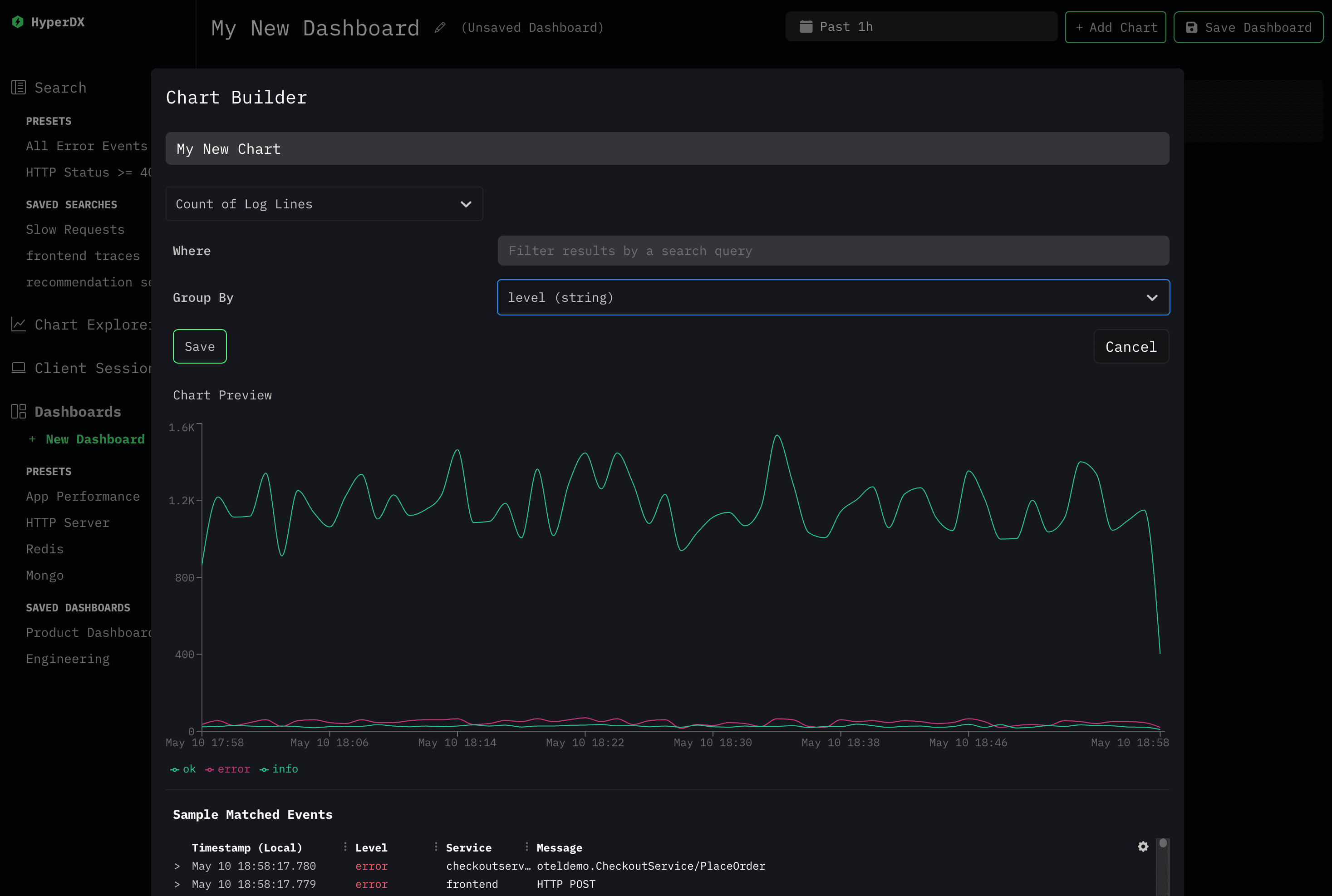
HyperDX allows you to graph and aggregate any event you send to it. You can create dashboards to visualize your data and share them with your team.

Create a Dashboard
You can get started creating a dashboard by clicking "+ New Dashboard" link below the Dashboards section of the app navigation.
NOTE: By default, dashboards are not saved until you choose to explicitly save them. Unsaved dashboards can be shared via their URL to other teammates or for later use.
You'll be able to create multiple charts on a dashboard. Each chart can be resized and moved around as desired.
We recommend that important dashboards should be saved after creation by clicking the "Save Dashboard" button on the top right of the Dashboard page.
Create a Chart
You can create a chart by clicking the "Add Chart" button on the top right of any dashboard.
A chart can be created with the following options:
- Name: The name of the chart, displayed within the dashboard.
- Aggregation Function: The function to use to aggregate the data. For
example
Count of Lines,Sum,Average,95th Percentile,Min, andMax. - Field: The field to aggregate on (when the aggregation function is not
count). - Where: The filter condition to use to filter the data to be graphed. For
example
level:errorduration:>5000. - Group By: The field to group the data by. For example
levelorhttp.route
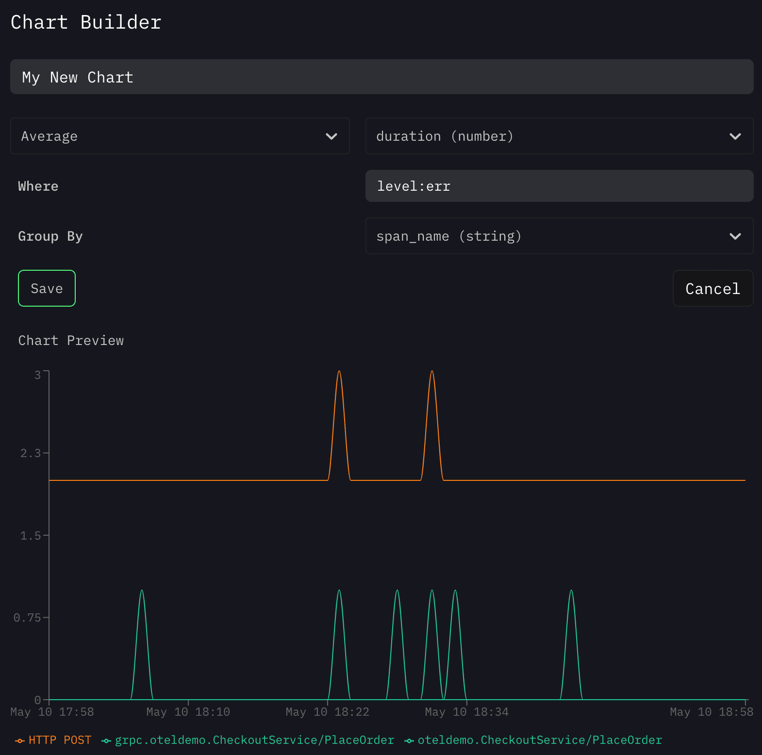
For example if you want to graph the average duration of error events grouped
by span_name, you'd set the following options:

Examples of Common Charts
Here are a few examples of common charts you can create in HyperDX:
Count of Error Events Grouped by Service
- Aggregation Function:
Count of Lines - Where:
level:err - Group By:
service
95th Percentile Latency of Span Events Grouped by Span Name
- Aggregation Function:
95th Percentile - Field:
duration - Group By:
span_name
HTTP Responses Grouped by Status Code
- Aggregation Function:
Count of Lines - Where:
span.kind:server - Group By:
http.status_code

